Braen Stone
Crafting a rock-solid digital design foundation for the future.
Category Website development, B2B branding
Building a rock-solid B2B brand foundation.
Braen Stone has been selling construction supplies since 1904, when legend has it Samuel Braen received the deed to a rock quarry to settle a gambling debt. Since then, Braen Stone has grown into a leading supplier of construction materials to builders across the New York metropolitan area.
And while the company has modernized, their website still felt stuck in the past, so they tapped JK to overhaul everything from the content, to the search engine optimization, to how their brand’s visual identity was portrayed on the site.
In the end, we delivered more than a new website—we created a new look and voice for the Braen Stone brand, ones that can be used well into the future.
Deliverables
- Research
- Persona development
- Creative strategy
- Messaging
- Visual identity
- Custom iconography
- Photography
- UI/UX design
- Copywriting
- Website development
No stone left unturned.
The first order of business was to get to know the people who would use the site—contractors who use stone and asphalt products for everything from paving roads, to landscaping, to preventing shoreline erosion, and many other industrious uses.
We did a deep dive and created personas and user journeys for each audience to ensure we would quickly address their needs on the site in a no-nonsense manner, as contractors consider time to be money and appreciate straightforward and quick online experiences.
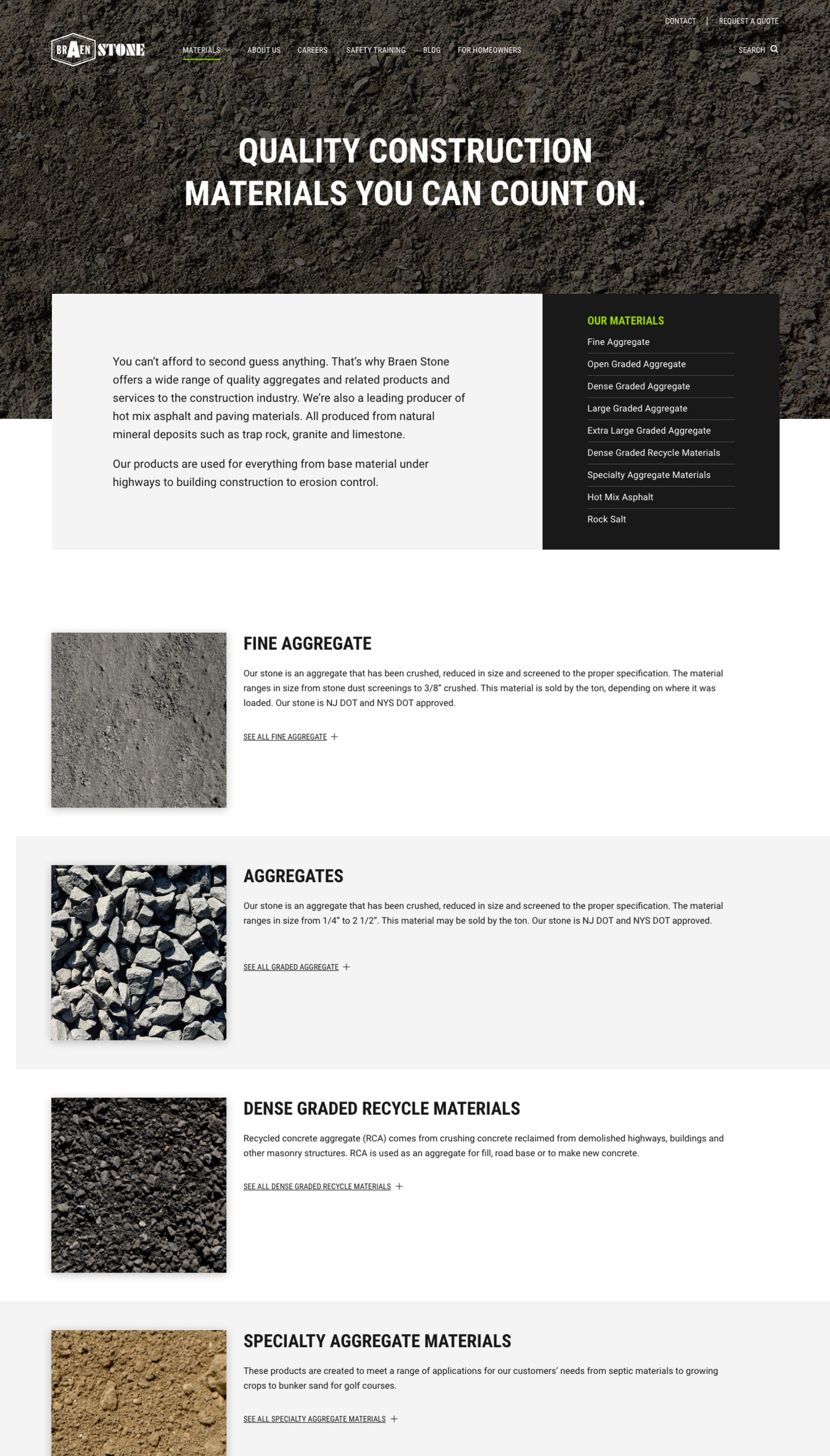
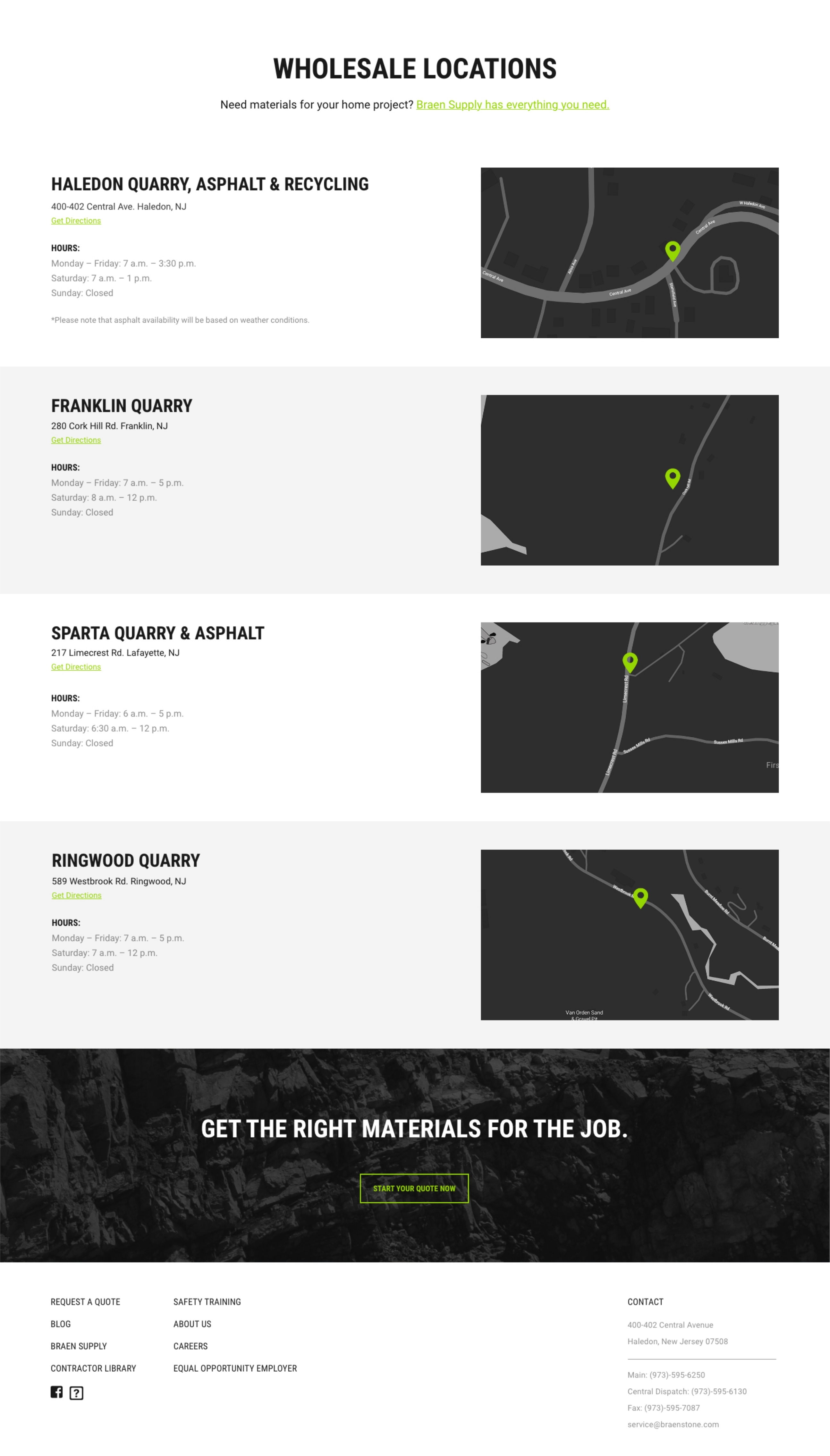
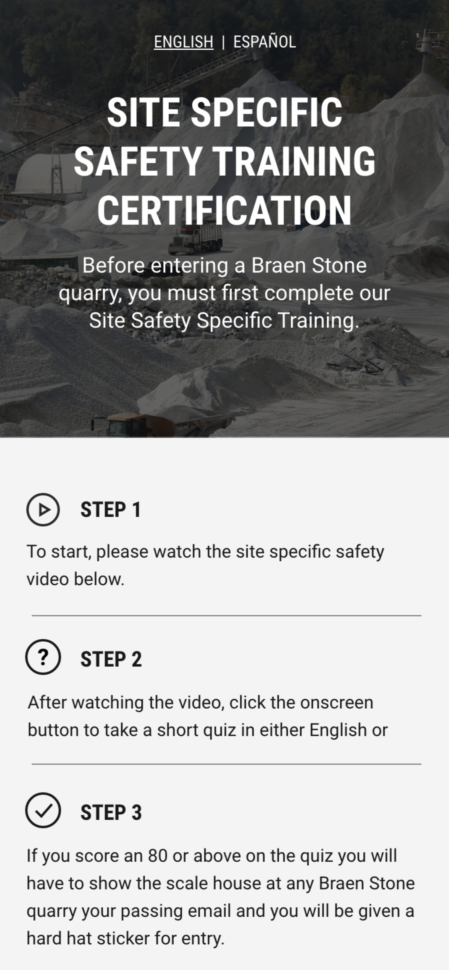
Using these insights, we then completely reworked the site structure and streamlined its contents, making it much easier to navigate and boosting its performance in organic search.
A design built to endure.
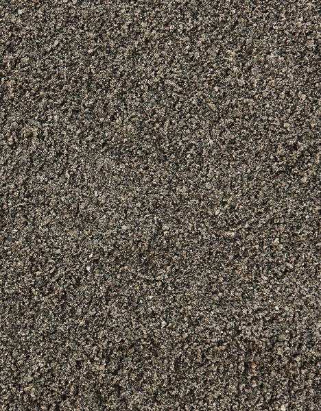
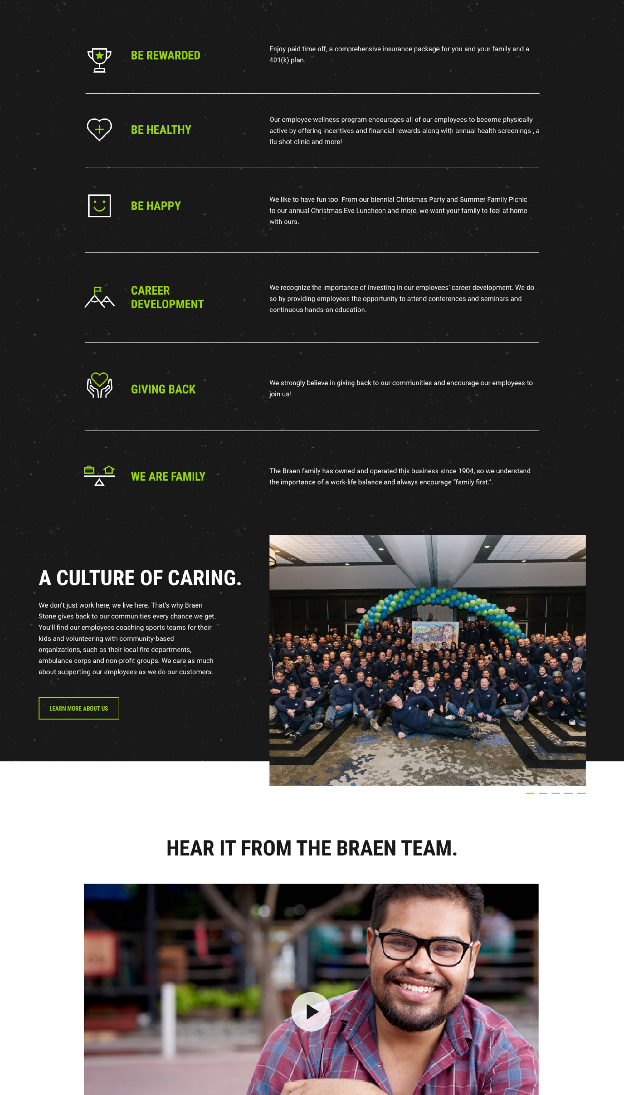
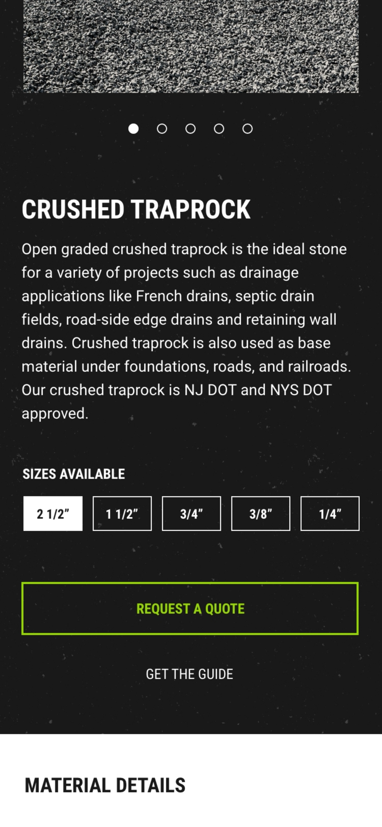
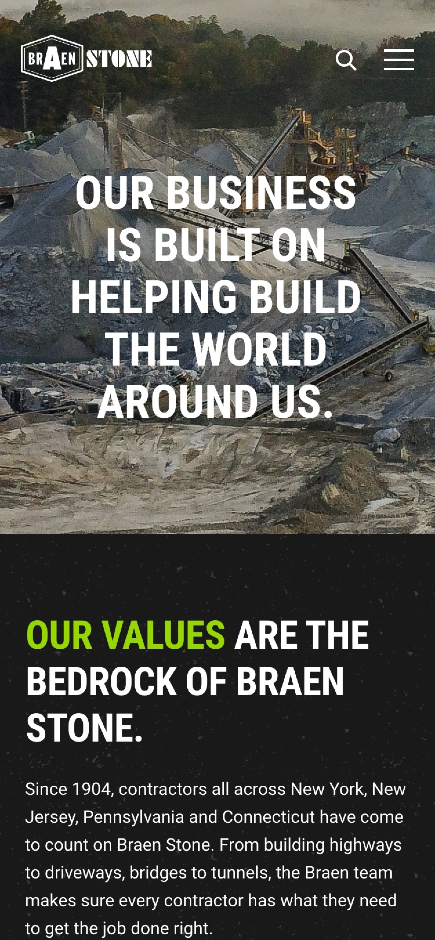
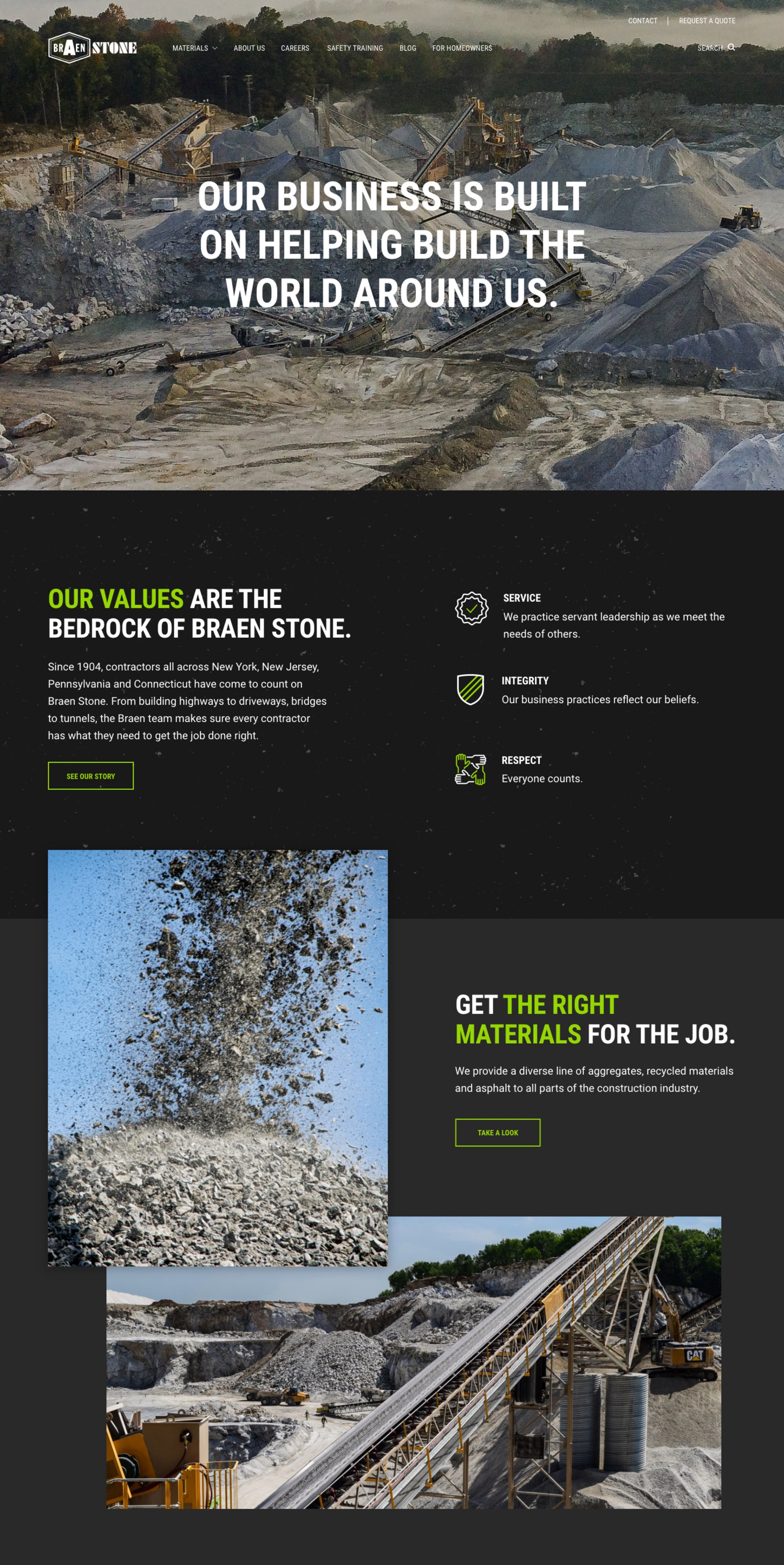
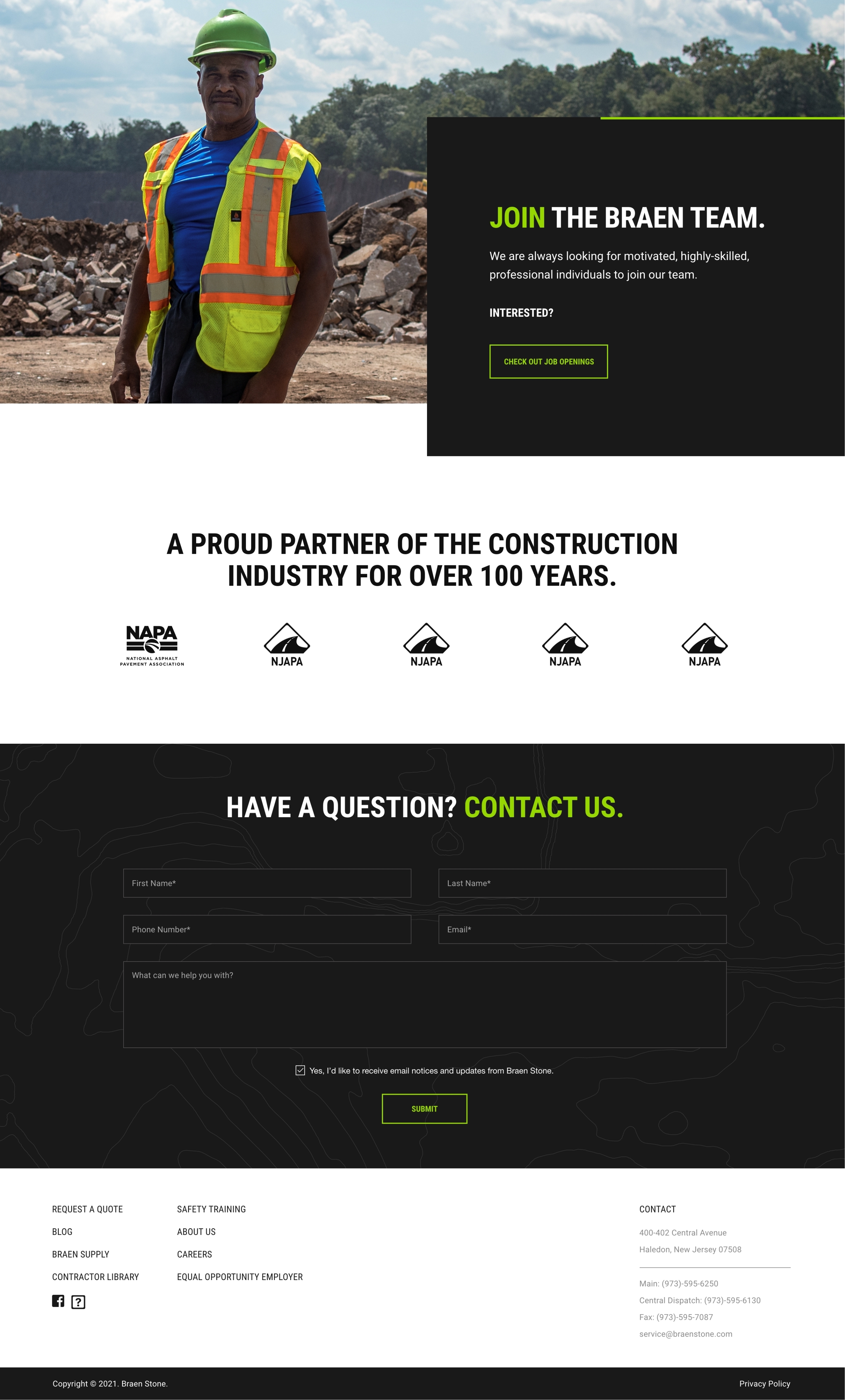
While this wasn’t an official rebranding project, Braen Stone wanted to use the design of their website—the centerpiece of their marketing efforts—to set a new tone for the brand. We obliged by flipping their color palette from light to dark, introducing more modern fonts, intensifying the color depth of their signature green accent and creating new rules for its use, introducing new brand textures, and helping them to find a new, more purposeful voice.
It all added up to a contemporary new visual identity and voice that perfectly reflected the purposeful character of the organization and could be used across Braen Stone’s marketing footprint to better attract and engage the contractors who are the lifeblood of their business.
Sending the right signals.
A strong visual identity is in the details, and for Braen Stone those details included a set of custom icons that added a layer of polish to their site design, sending a subtle but meaningful message about their sophistication as a business and a brand.
Capturing the essence of the brand.
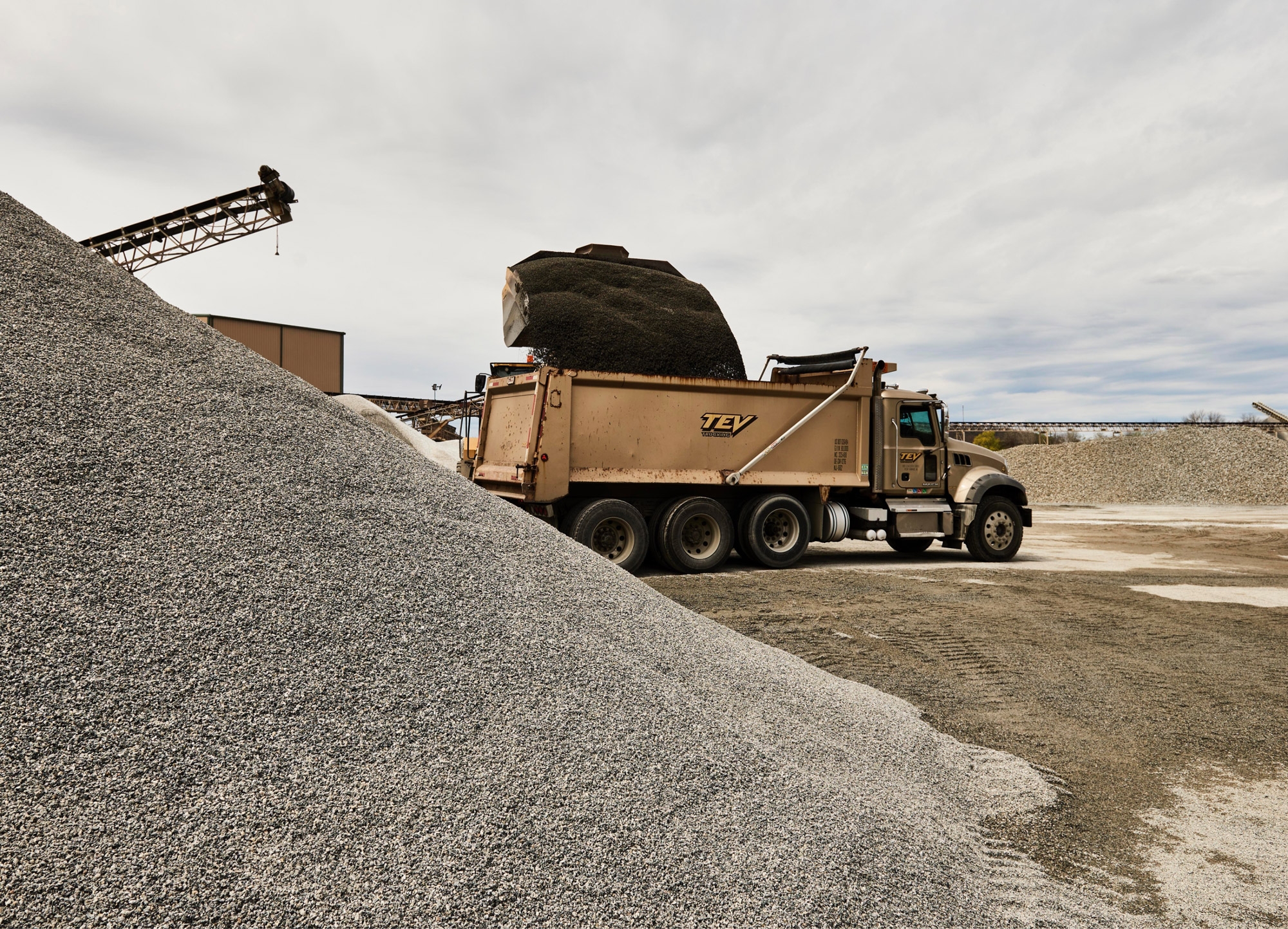
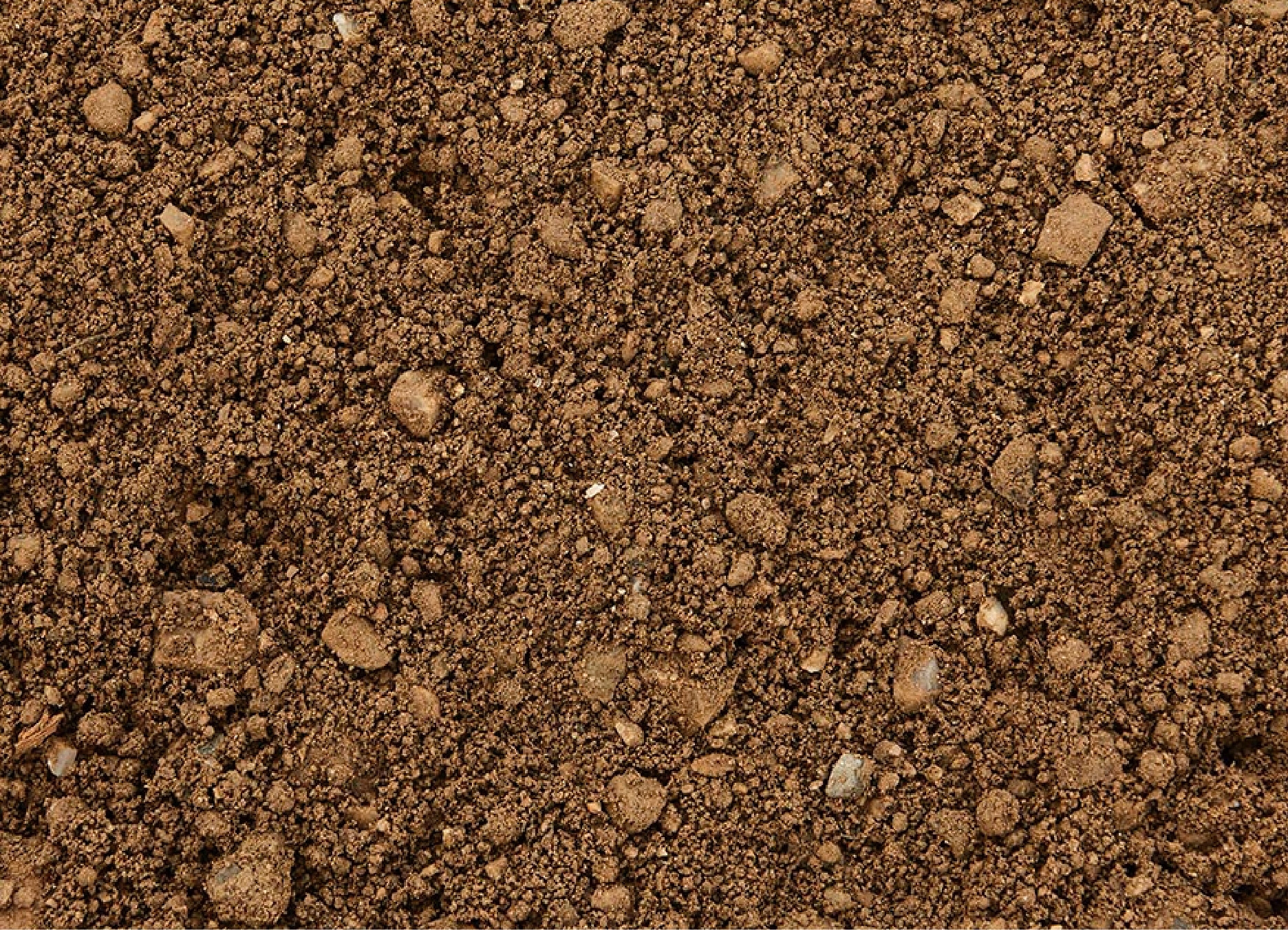
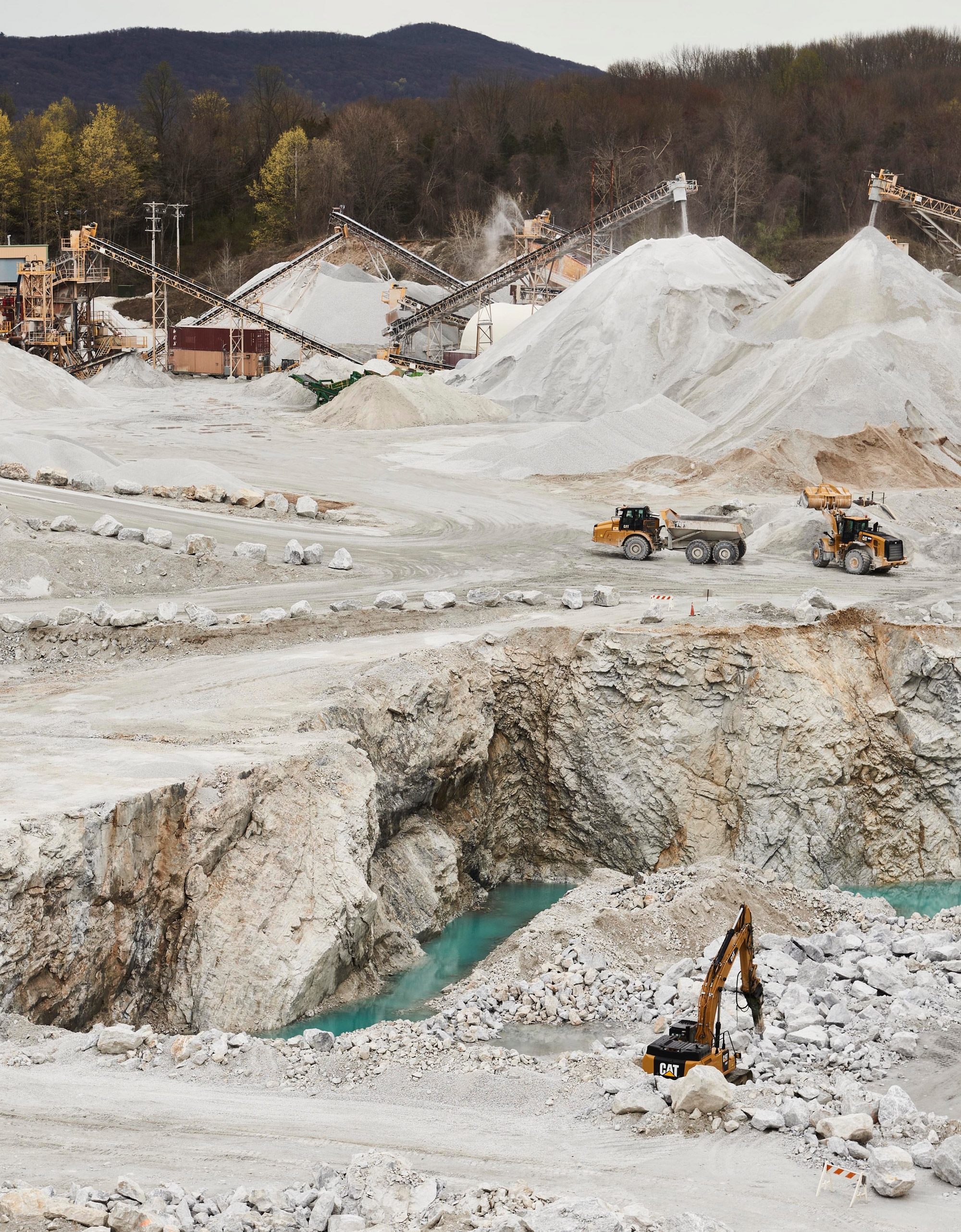
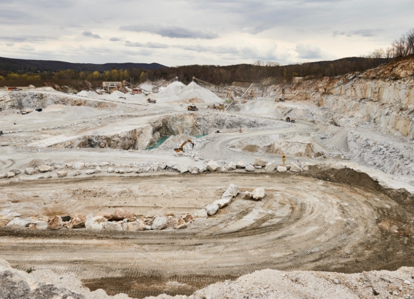
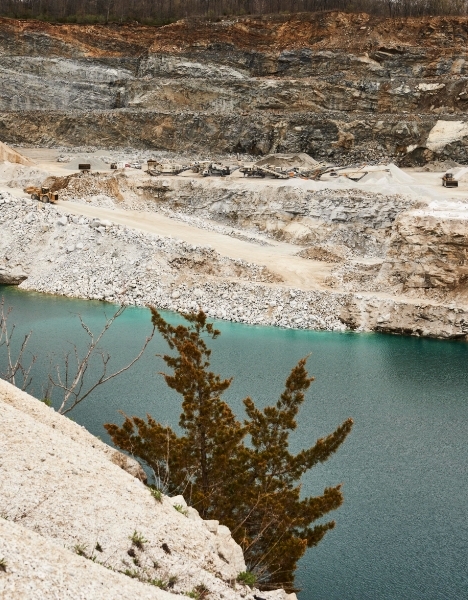
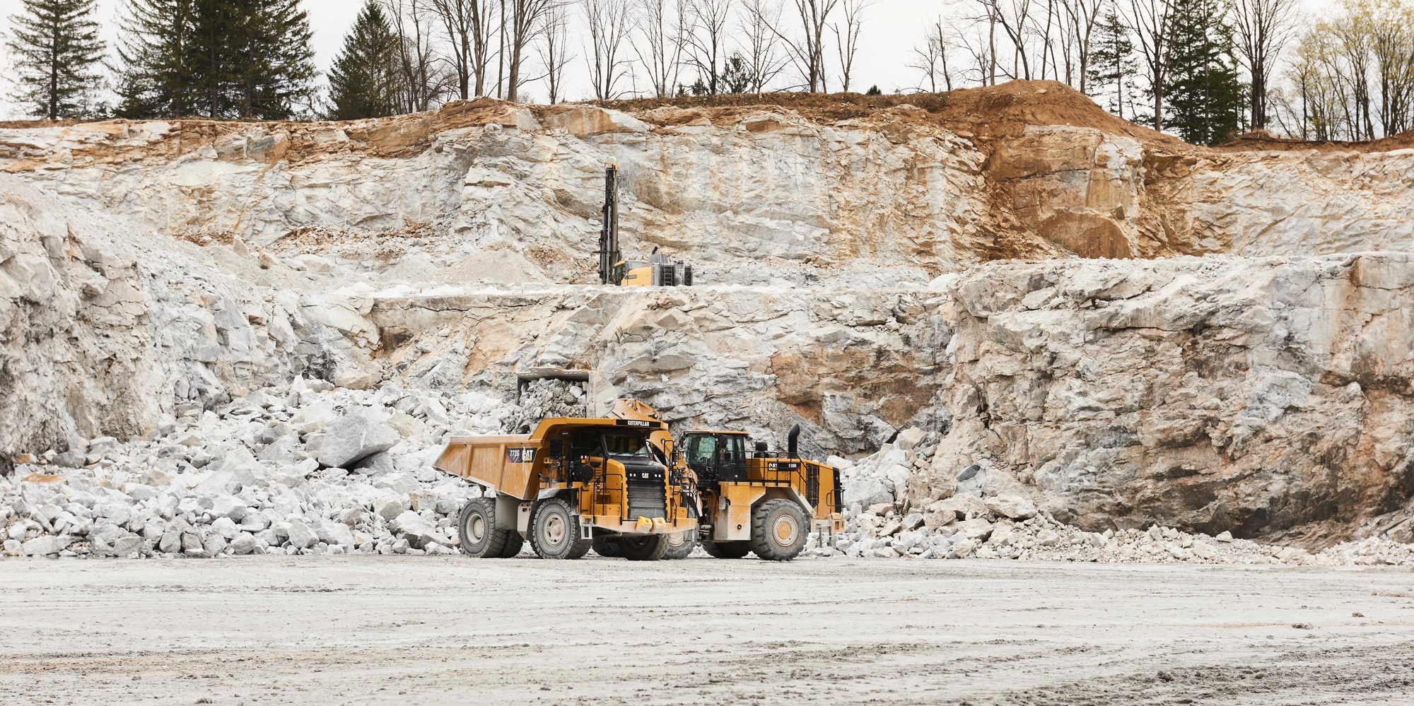
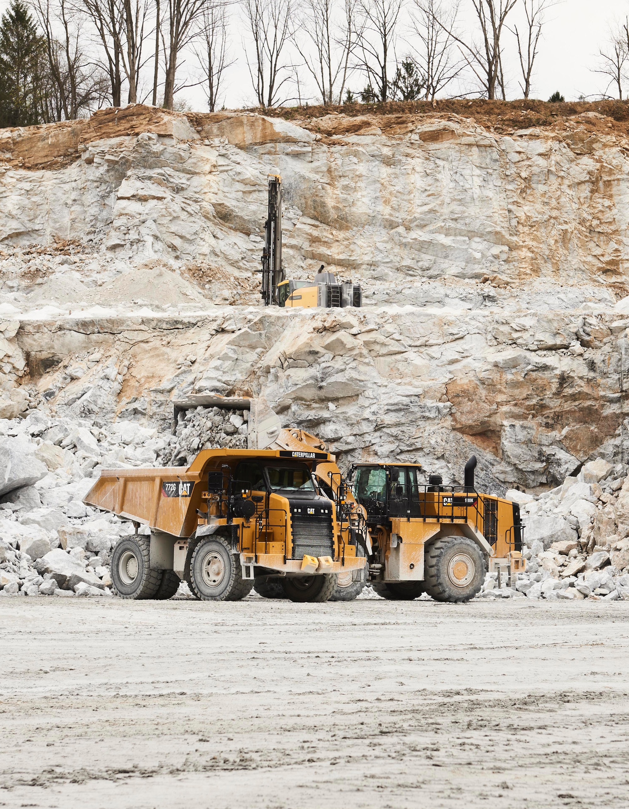
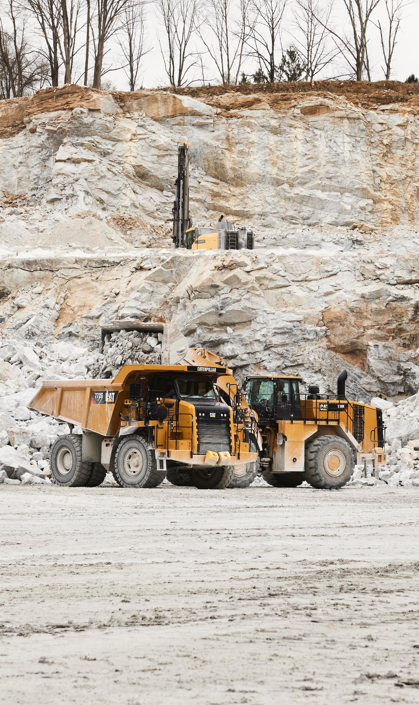
A picture can say a thousand words, and Braen Stone wanted theirs to say all the right things. That’s why they asked us to travel to each of their quarries and capture high-quality photography and drone footage for use across the website and in other marketing materials. In the end we created a library of product shots, action stills, fly-by videos, and images of workers in action that artfully captured Braen Stone’s dedication to quality, safety, and efficiency, as well as the impressive scale of their business.
The next step on the path.
Braen Stone was so pleased with our collaborative process and our dedication to partnership that they asked us to help reimagine the web presence of their consumer-facing brand, Braen Supply. It’s a complex project, but one we’re eager to dive into as we continue to help define the future of the Braen brand.
